-
datathon1.case카테고리 없음 2022. 3. 8. 12:26
https://www.kaggle.com/melodyelect/covid19/edit
여기를 분석해보았다.
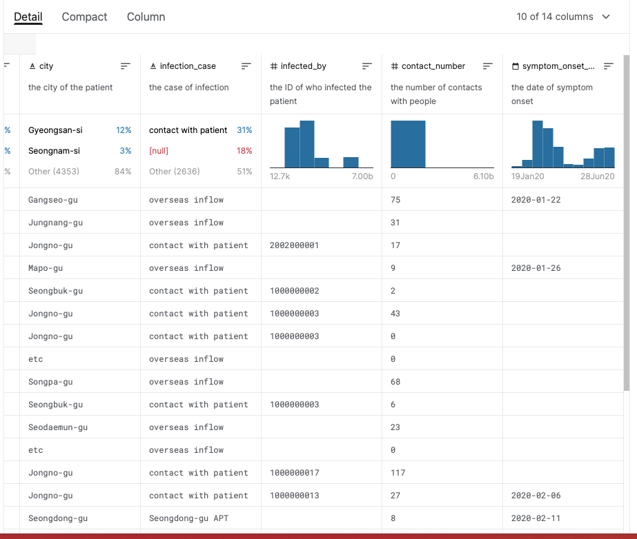
환자인포에서는
환자의 도시,
어디에서 컨택이 되었는지,
환자번호 몇번에서 감염됬는지,
컨택한 사람 숫자,
증상이 발현 시기에 대해 나와 있다.
간략히 데이터에 대해서 보면 경산시 12퍼 성남시 3퍼 이다
환자접촉은 31 프로, null 이 18프로, other 는 51프로이다.
infected_by 는 고유값을 찾아서 Len 으로 봐야할것같다
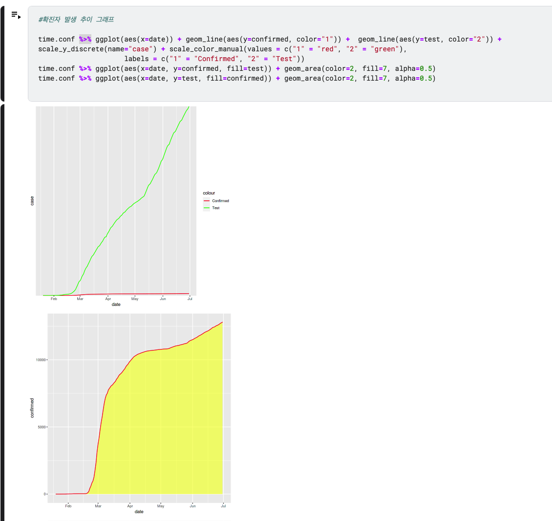
symptom_onset 과 cumulative 넘버(누적 환자수)를 비교해 보면 좋을 것 같다.
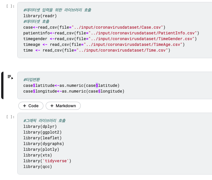
numeric 이므로 숫자형으로 타입 변환해 준것이다.
$ 는 case 파일 안에 있는 latitude 칼럼을 선택하는 용도인것 같다.

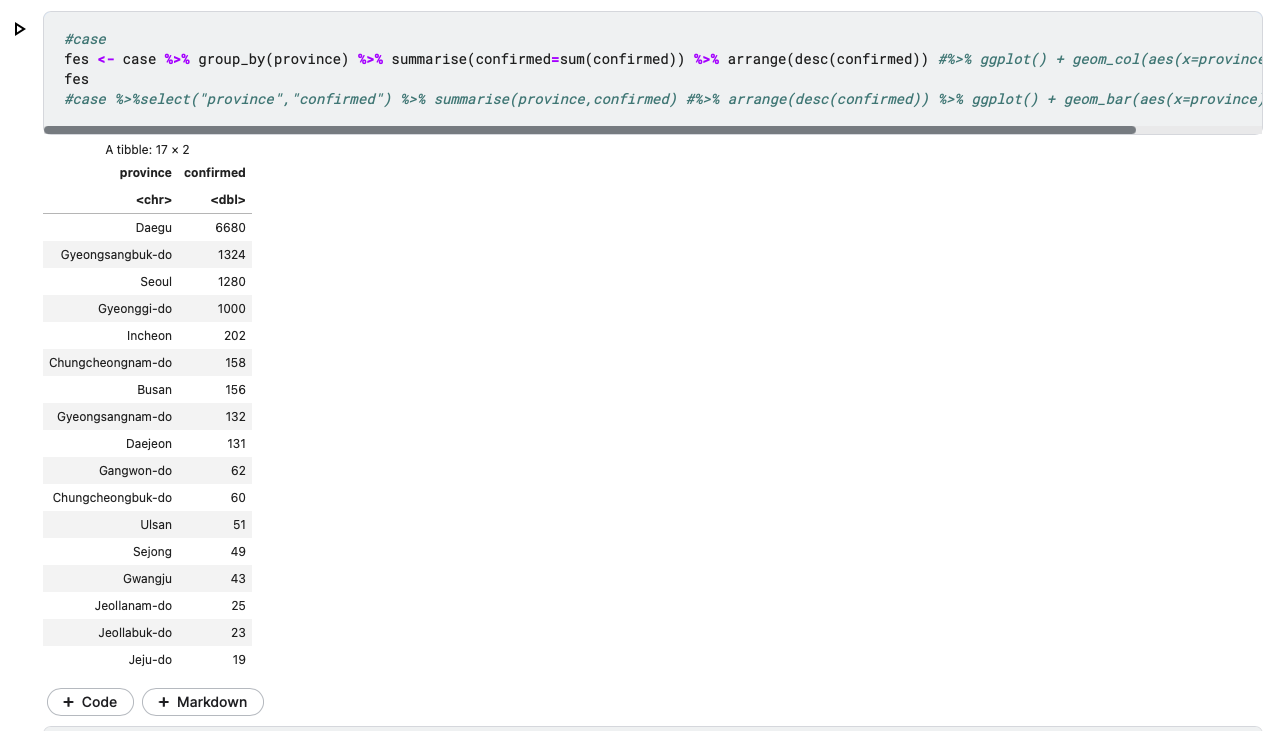
3. descending(내림차순)
2. sum을 내림차순
1. province 에 대해서 group by
dataframe 형태로
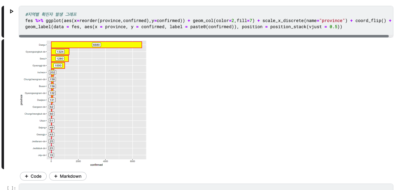
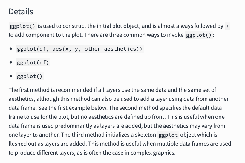
ggplot 객체 .
aes : 메소드로, 다른 데이터 프레임의 데이터를 이용하여 새로운 레이어를 만들때 씁니다.
this method can also be used to add a layer using data from another data frame.
province (지역) 을 confirmed 순으로 reorder (재나열) 시켜줌
province = y 축
confirmed = x 축
#나이별 확진자 추이 그래프
#head(timeage)
timeage %>% group_by(date,age) %>% summarise(confirmed=sum(confirmed)) %>% ggplot(aes(x=date, y=confirmed, fill=age)) +
geom_area(size=0.2,alpha=0.4) + geom_line(position='stack',size=0.2) + facet_wrap(~ age)

timeage %>% group_by(date,age) %>% summarise(confirmed=sum(confirmed)) %>% ggplot(aes(x=date, y=confirmed, fill=age)) +
geom_area(size=0.2,alpha=0.4) + geom_line(position='stack',size=0.2)+  scale_fill_brewer(palette="Blues")+  guides(fill=guide_legend(reverse=TRUE))

timeage %>% group_by(age) %>% summarise(confirmed=sum(confirmed)) %>% ggplot(aes(x='', y=age, fill=age))+
geom_bar(stat='identity')+ theme_void()+ coord_polar('y', start=0)
facet_wrap
scale_fill_brewer
coord_polar(극 좌표)
여러 패널을 plot 할 수 있는 함수이다.
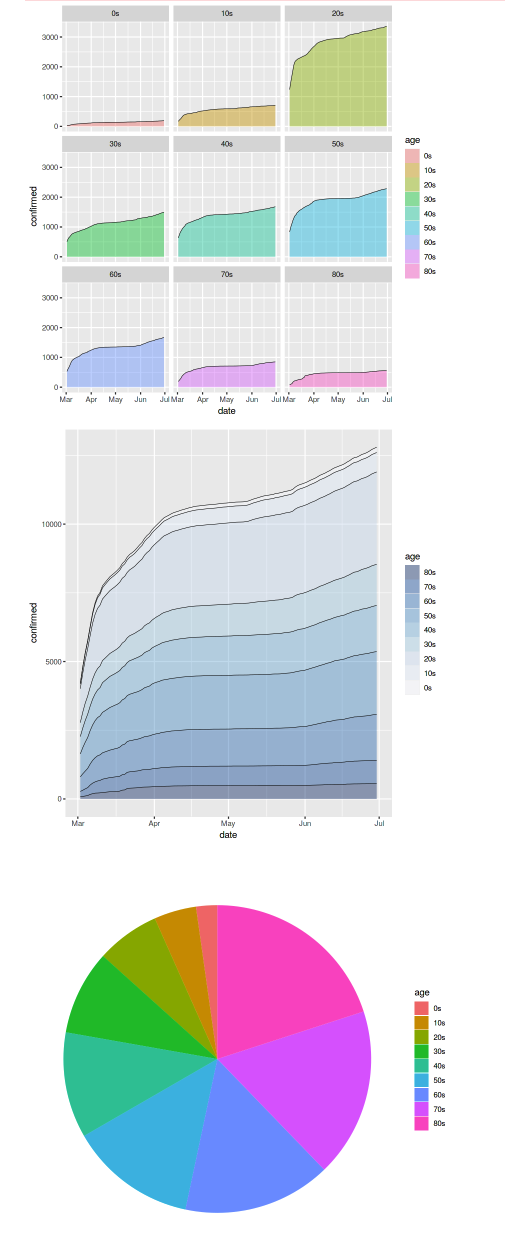
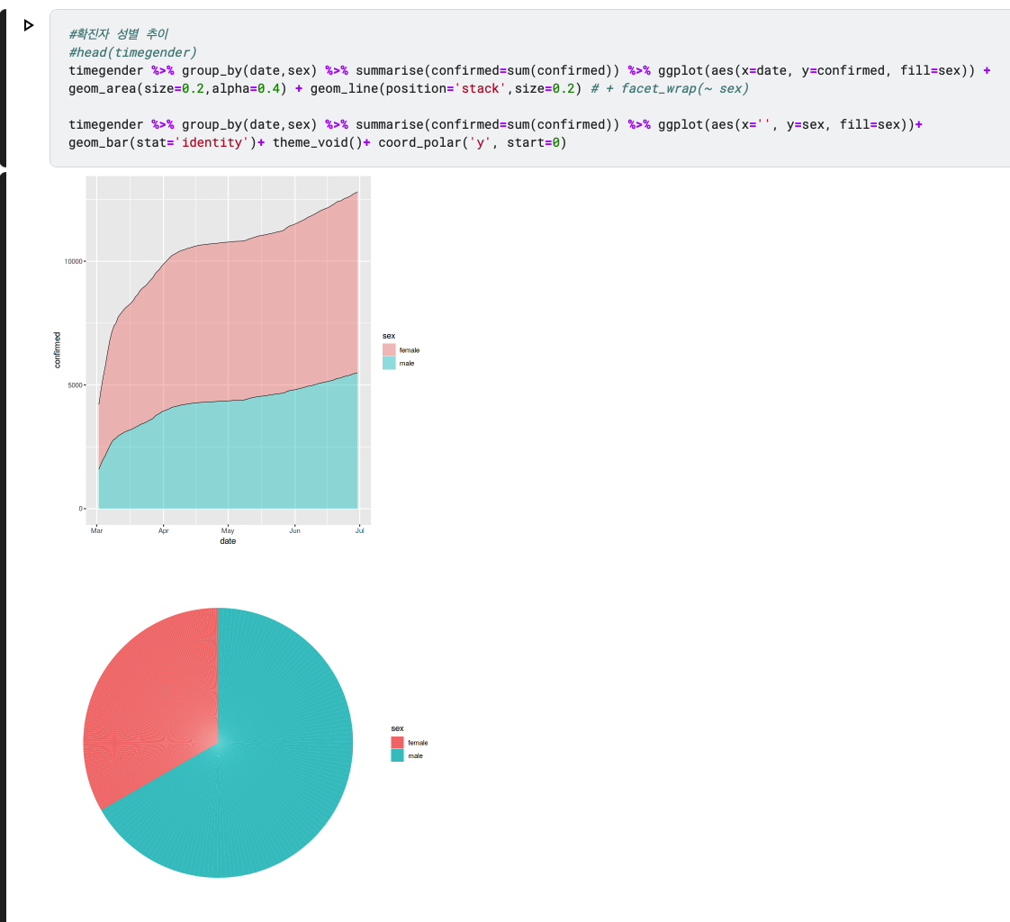
fill = sex
geom_line(position = ' stack', size = 0.2) 스택이므로 쌓는다..
극좌표이므로 x는 아무것도 없다. y 만 이동하는 변수이므로, coord_polar 에 y 만 써준다.

반드시 identity 를 써주어야 한다